
Olha
Concept
Creating a Visual Language That Resonates with Stillness and Sound
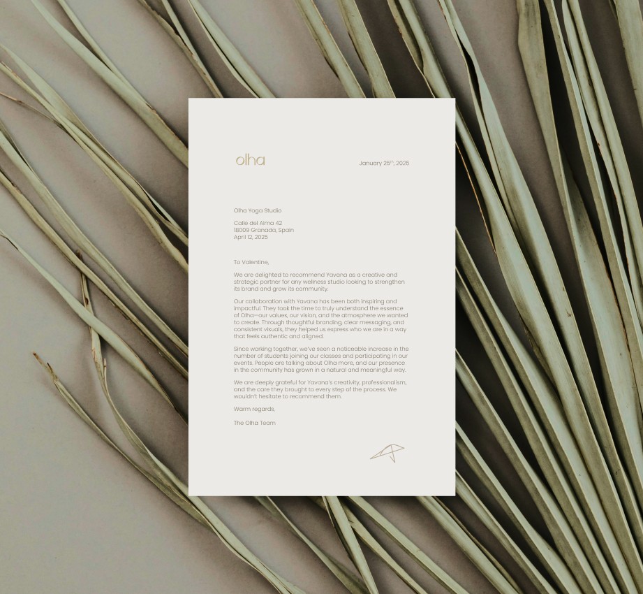
Olha is a meditation and sound bath studio grounded in the healing properties of sound frequencies. We approached this project with the intention of translating the immersive, resonant atmosphere of a sound bath into a brand identity that feels gentle, spacious, and deeply grounded. The concept revolves around neutrality—not only in color, but in emotion. It’s designed to be calming but present, spiritual but not esoteric. The experience is intimate and sensory, and we needed the brand to hold space for that.
Concept
Creating a Visual Language That Resonates with Stillness and Sound
Olha is a meditation and sound bath studio grounded in the healing properties of sound frequencies. We approached this project with the intention of translating the immersive, resonant atmosphere of a sound bath into a brand identity that feels gentle, spacious, and deeply grounded. The concept revolves around neutrality—not only in color, but in emotion. It’s designed to be calming but present, spiritual but not esoteric. The experience is intimate and sensory, and we needed the brand to hold space for that.

Visual Identity
Design That Echoes the Frequency of Healing
We chose a palette of warm neutrals to mirror the soft glow of golden sound bowls used in the studio and to allow the photography to breathe. The brand leans into minimalism not just as an aesthetic, but as a way to center attention—on sound, on stillness, on subtle shifts. The logo was designed with intention: the “o” and “l” in Olha subtly reference the bowl and the striker, embedding the tools of the practice into the name itself. This symbolic simplicity makes the logo feel like part of the ritual.


Content
Sound That Speaks Beyond the Studio
The social media strategy for Olha focuses on emotional resonance—sharing content around sound frequencies, the science of healing through vibration, and gentle inspiration through words. The tone is reflective, serene, and nurturing, aligning with the experience clients receive in the studio. We created a visual system that supports this with subtle movement, grounded typography, and a sense of space in every post. The result is a feed that feels more like a breath than a scroll—intentional, curated, and quietly powerful.


Application
From Studio Rituals to Digital Presence
We extended the brand’s tone and minimal elegance across all touchpoints: from printed materials to digital assets and guided content. Every detail was meant to honor the practice itself. The typography system was kept light and airy, the color palette consistent with natural textures, and photography direction emphasized light, reflection, and intimacy. With Olha, the brand is not just a container for information—it becomes part of the meditative journey.
More Works
More Works
More Works

FAQ
FAQ
FAQ
01
How do I know if I’m ready to invest in branding?
02
What if I already have a logo or website?
03
How long does the branding process take?
04
What’s the investment for working with you?
05
What happens if I’m not sure what I need?
06
What do I need to get started?
How do I know if I’m ready to invest in branding?
What if I already have a logo or website?
How long does the branding process take?
What’s the investment for working with you?
What happens if I’m not sure what I need?
What do I need to get started?
01
How do I know if I’m ready to invest in branding?
02
What if I already have a logo or website?
03
How long does the branding process take?
04
What’s the investment for working with you?
05
What happens if I’m not sure what I need?
06
What do I need to get started?